Manus has been releasing new features, and their latest feature, a Data Visualization tool, is something simple yet crucial, as it is part of the everyday work of millions or even billions of people across many different industries.
We already know what data visualization is; it shows data through the use of common graphics, such as charts, infographics, plots, and animation. However, it is not as simple as it may sound. Data visualization can take you anywhere from a few minutes to a few weeks to complete, depending on your data size and skills. Hence, the need for a data visualization tool.
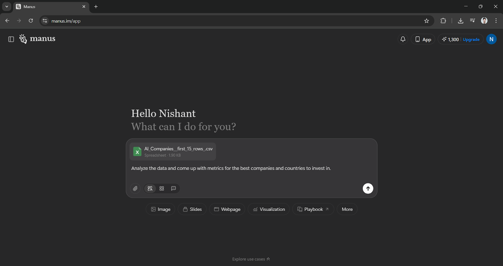
Manus pitch is simple: you upload the file, describe the view you want, and let the agent turn it into presentation‑ready graphics in minutes.
Why spreadsheets stall
Even experienced analysts could waste hours organizing columns or prompting chart labels so a slide doesn't look sloppy. Surveys from Gartner and Deloitte routinely rank "data prep" as the most time‑consuming stage of analytics projects. That grunt work and the cognitive load of flipping between Excel, PowerPoint, and some cloud dashboard push many teams to skip visual exploration altogether. Manus reframes the workflow: cleaning, charting, and packaging live behind a single prompt.
The Manus Data Visualization feature, as you have already guessed, has several features that make the process of data analysis simple. It allows users to turn complicated datasets into clean, interactive charts without the manual effort typically required.
Here are some of the main functions/features of Manus Data Visualization:
- Direct Data Upload: You can upload your raw dataset directly into the system.
- Natural Language Prompts: Instead of coding or using complex menus, you describe the charts or insights you need in plain English.
- Automated Chart Creation: The tool automatically renders visuals based on your description, avoiding the need for pivot tables or manual chart builders.
- Presentation-Ready Output: The visuals are designed to be immediately useful for dashboards, reports, and presentations.
How to use the Manus Data Visualization feature to create stunning data graphs:
Step 1: Go to the Manus AI website and create an account. It is definitely worth it.
- You can directly add the CSV file to the chatbox and add a simple prompt stating what you want.
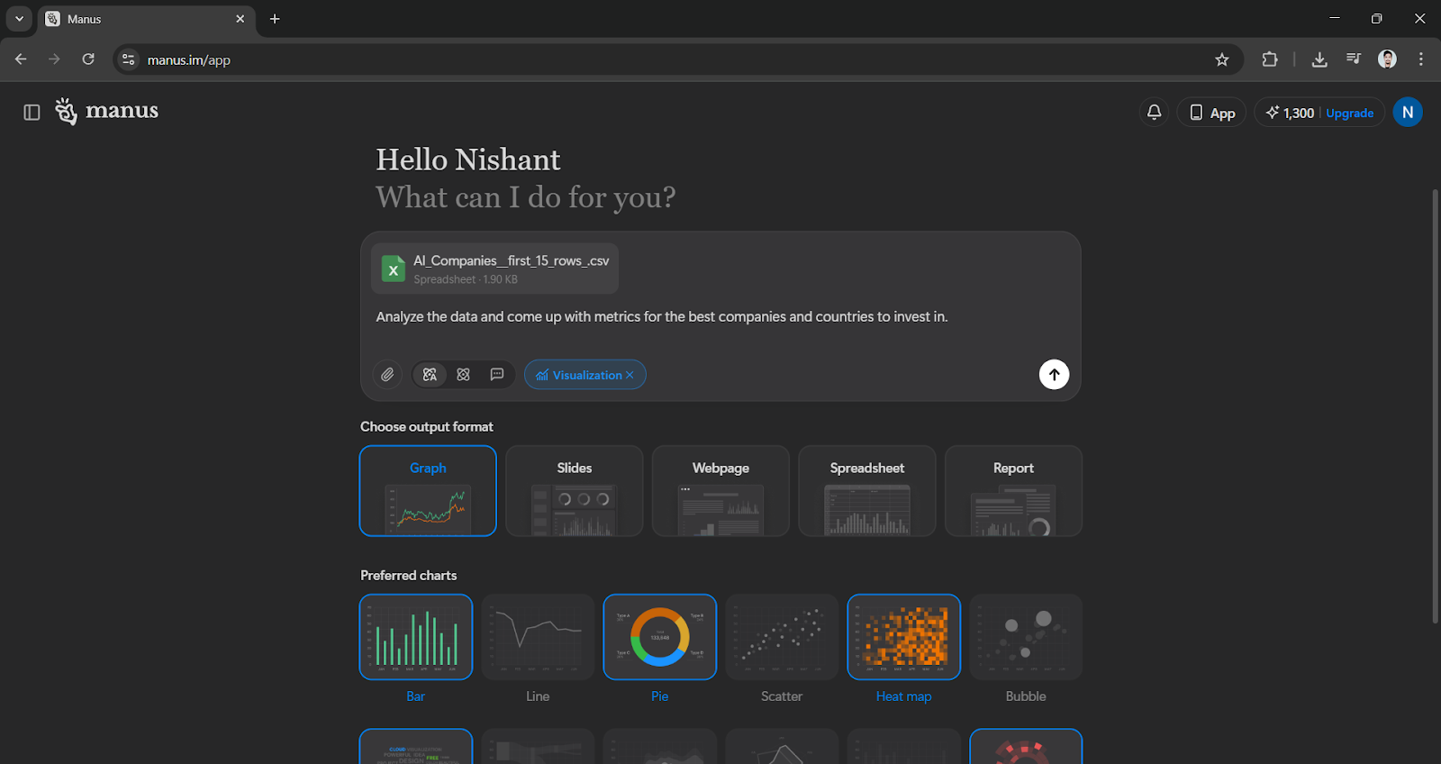
Step 2: Make sure to click on the visualization option right below the chatbox.
- Manus will then give you two options: output format and preferred charts.
- It is recommended to choose up to 5 chart types for a comprehensive analysis.
Step 3: After finishing the first two steps mentioned above, let it work and complete the data visualization for you.
Conclusion
This method of handling data is part of a larger trend of building artificial intelligence (AI) into everyday business tasks, using agents. And to be fair, data‑literate teams shouldn't and can't afford to spend half a day filtering and comprehending rows that should have been visualized in five minutes. What Manus Data Visualization does is not allow professionals to create graphs, but to allow them to focus on the narrative and the output. Mind you, it's not a full BI replacement—yet—but for fast, on‑demand visualization automation, it could be a great help.